Showing posts with label WEBSITE. Show all posts
Friday, 14 January 2011
final website design
This is our website finished. As you can see we stuck to the vibrant colours and the use of imagery surrounding the title. We added writing and information to show that the website is social and connects with the audience.
Friday, 17 December 2010
More on the website
We added these brightly outlined boxes to include information under the handwritten headings. We chose colours that matched the background.
We also added links to the website, these lead to other pages.
Friday, 26 November 2010
progress on website
We have decided to choose this background Jordan made on photoshop as it brings out the 'fun' side of Ke$ha and reflects the song title more. We also started to think about fonts for our site and couldn't find a suitable one from the internet. Therefore we decided to make our own, we did this by handwritten text and then scanned it in, we then changed the colour on photoshop.
We also added a picture to our site to shape around the title that we took on our recent shoot.
Sunday, 14 November 2010
Website, backgrounds.
This was our first website design we started to create. We liked the background as it is very mystical and has the rock/pop feel that Kesha portrays. However after researching Kesha's own official website we discovered that the background on the enter page is very similar to this one, this wasnt too much of a problem as this one looks more space like than the other one. But when we came to think about it and got feedback from our teacher, we decided to create another background that can relate to Kesha as being a more fun artist.

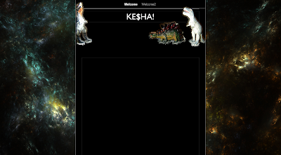
This is our second background we created using photoshop (using the custom shape tool). It took awhile to get the alignments of the dinosaurs correct and to get them facing in towards eachother. The dinosaur background has a fun and colourful vibe to it. It connects well with the song 'dinosaur' and yet because of the black background it still feels like the right genre kesha gives.
Our original idea however was to use some sort of glitter as the background, as kesha is known for the glamourous shine. But because we wanted to include something different and relate more to the song we left it plain and simple (although we may include some use of glitter later on).

This is our second background we created using photoshop (using the custom shape tool). It took awhile to get the alignments of the dinosaurs correct and to get them facing in towards eachother. The dinosaur background has a fun and colourful vibe to it. It connects well with the song 'dinosaur' and yet because of the black background it still feels like the right genre kesha gives.
Our original idea however was to use some sort of glitter as the background, as kesha is known for the glamourous shine. But because we wanted to include something different and relate more to the song we left it plain and simple (although we may include some use of glitter later on).
INTIAL DESIGN IDEAS
This sheet indicates our first initial design for our website. We focused firstly on the layout and stuck with the main idea of text being viewed in the middle of the screen. We also stayed with the idea of using black as a main colour scheme, this is because of the pop/rock genre we want to portray. This sheet has other ideas such as imagery thoughts and title font display.
Friday, 5 November 2010
Case Study: Mark Ronson

Website Analysis
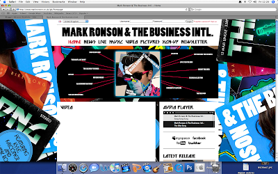
The bright colours of the website and the retro feel links to the style of him as a very poppy/electro artist. It reminds us of his songs and to his album 'Mark Ronson and The Business International'. The fact that the background is of album covers relates back to him promoting his latest album.
The main functions of the website is to research and understand him more as an artist. The website allows us to view his videos and click on links to see latest news articles on where he is, what he's doing and when his tour dates are up and running. There is also a gallery to view images of him at gigs etc, this is nice for fans to see him in action.
This is an example of a comment on his 'latest news' section from a fan :
about 1 week ago Thawiz870 wrote:
Congrats Mark ! Fabulous work ! Your new album is amazing, you've put together something special, enjoy the praise !
Allowing fans to comment on each page shows a connection between the artist and his fans through which they can encourage him and give their own opinions. There is also a link which enables fans to sign up which shows an interactive side to the website.
Postmodernism an Nostalgia
There are 14 inter-textual links which are songs that surround the album cover image, almost like a spider diagram, and when you hover your mouse over the song title or image it zooms in and you can navigate around to the other links.
This is one of the 80's cd covers used in Mark Ronsons album cover, as you can see part of the hair near the front. This is almost like pop art image which is very popular and can relate to the 80's style.
Subscribe to:
Posts (Atom)