Website Analysis
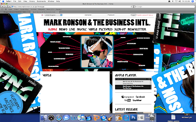
The bright colours of the website and the retro feel links to the style of him as a very poppy/electro artist. It reminds us of his songs and to his album 'Mark Ronson and The Business International'. The fact that the background is of album covers relates back to him promoting his latest album.
The main functions of the website is to research and understand him more as an artist. The website allows us to view his videos and click on links to see latest news articles on where he is, what he's doing and when his tour dates are up and running. There is also a gallery to view images of him at gigs etc, this is nice for fans to see him in action.
This is an example of a comment on his 'latest news' section from a fan :
about 1 week ago Thawiz870 wrote:
Congrats Mark ! Fabulous work ! Your new album is amazing, you've put together something special, enjoy the praise !
Allowing fans to comment on each page shows a connection between the artist and his fans through which they can encourage him and give their own opinions. There is also a link which enables fans to sign up which shows an interactive side to the website.
Postmodernism an Nostalgia
There are 14 inter-textual links which are songs that surround the album cover image, almost like a spider diagram, and when you hover your mouse over the song title or image it zooms in and you can navigate around to the other links.
This is one of the 80's cd covers used in Mark Ronsons album cover, as you can see part of the hair near the front. This is almost like pop art image which is very popular and can relate to the 80's style.
This is one of the 80's cd covers used in Mark Ronsons album cover, as you can see part of the hair near the front. This is almost like pop art image which is very popular and can relate to the 80's style.

No comments:
Post a Comment