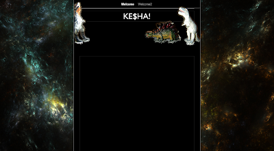
This is our second background we created using photoshop (using the custom shape tool). It took awhile to get the alignments of the dinosaurs correct and to get them facing in towards eachother. The dinosaur background has a fun and colourful vibe to it. It connects well with the song 'dinosaur' and yet because of the black background it still feels like the right genre kesha gives.
Our original idea however was to use some sort of glitter as the background, as kesha is known for the glamourous shine. But because we wanted to include something different and relate more to the song we left it plain and simple (although we may include some use of glitter later on).
INTIAL DESIGN IDEAS
This sheet indicates our first initial design for our website. We focused firstly on the layout and stuck with the main idea of text being viewed in the middle of the screen. We also stayed with the idea of using black as a main colour scheme, this is because of the pop/rock genre we want to portray. This sheet has other ideas such as imagery thoughts and title font display.


No comments:
Post a Comment