Friday, 17 December 2010
inspiration for cd
We would like to take a picture similar to this to put on the back of our c.d. cover. We could use ripped up foil and create a shiny effect infront of her.
More on the website
We added these brightly outlined boxes to include information under the handwritten headings. We chose colours that matched the background.
We also added links to the website, these lead to other pages.
Cd cover
This is what we've started on our c.d. cover. we took the picture in college and then edited it on photoshop, changing the contrast and adding more sequins. We were worried about not being able to see the writing on the hand , however with the editing you can see the letters better. We still need to complete the back of the c.d. but need more pictures to do so (preferably a close-up of our actress from a side view).
Tuesday, 14 December 2010
Audience feedback
We have had feedback on our video so far and are pleased with what was said. comments are as follow "The shots you have are really good- will look good when its finished. Saw a hand in one of the glitter shots. Really liked the beginning shot. split screen really good."
From this we can now able to re-shoot the stuff which need re-shoot. We are also able to know what went well and what didn't know and therefore able to use this information next time we shoot.
From this we can now able to re-shoot the stuff which need re-shoot. We are also able to know what went well and what didn't know and therefore able to use this information next time we shoot.
Film Day
We are going to film today.
We are hoping to film the rest of the inside bits today.
Because we are going so late to the location (after college which is 4pm+) it's going to be pretty dark and for this reason alone we aren't going to film outside.
This is the weather report for today. The weather conditions are decent so we should have any problems getting to the location.
Unfortunately were unable to film this evening as our main female actor had last minute problems, so we are hopefully planning to film on saturday depending on the weather.
Tuesday, 7 December 2010
Snow Week - 30/11/10 to the 3/12/10.
Last week Nottingham got hit by severe weather (snow, wind and sleet) and therefore the college was closed. Because of this our deadline which was on the December 16th has now been extended to 11th January (after the Christmas holidays).
We couldn't meet up or get into college to try and do any media work, therefore no work was done at all last week.
Peace out.
We couldn't meet up or get into college to try and do any media work, therefore no work was done at all last week.
Peace out.
Friday, 26 November 2010
Preview of Video.
Here is a preview of the spilt screen clip that we did today. We chose to do this to add variety to our shot types and editing. We also did this because the clip itself was too long, so adding the spilt screen made it more interesting and wouldn't bore the audience.
progress on website
We have decided to choose this background Jordan made on photoshop as it brings out the 'fun' side of Ke$ha and reflects the song title more. We also started to think about fonts for our site and couldn't find a suitable one from the internet. Therefore we decided to make our own, we did this by handwritten text and then scanned it in, we then changed the colour on photoshop.
We also added a picture to our site to shape around the title that we took on our recent shoot.
Tuesday, 23 November 2010
images
As well as shooting we took a few photos to use for either our website or c.d. cover. Here are some we may use -
Also we took a few pictures of the location (the white room) and the main girls make-up.
saturdays shoot
On saturday we managed to get a bit done, however we didn't manage to film outside as it was drizzling and foggy. Some of the shots were a bit out of focus and fuzzy so therefore may need to re-shoot when we go back to film more at that location.
Friday, 19 November 2010
Last Friday 12/11/2010
Last friday, we had a media music video workshop day. In this day, we had 3 different workshops.
1. Make-up
In this workshop, there was a previous student who did a make up course, she is working with companies like BBC to do make up for things like shameless. She showed us what the easiest way to apply make up was and how we need to go through this procedure every time we shoot to maintain continuity.
2. Previous Music Videos
This workshop was interesting to see other students past work and to discuss our own music video to previous students so that they could give us some feedback and advice.
3. Directing
Here we got the chance to have a go at directing actors and doing a non-editing filming task.
Overall we think the day was helpful.
Weather
We are hoping to film more tomorrow (saturday). However we can see from the weather forecast that its going to be misty with drizzle later in the afternoon, therefore we may have to just film the inside scene in the house from our locations.
What we've been up to!
On Tuesday in lesson we had a change of plan with our actors. We really wanted to start filming on wednesday, but obviously the main girl had arrangements with another media group. Therefore we contacted every girl we could think of and eventually found someone (in which we are sooooo thankful to her). We also had to change our male actor, but the new actor was arranged before tuesday which made things abit better.
Wednesday
On wednesday at the start of lunch we began filming the scene in the white room. We chose to do this day as we were all in college at that point and the weather wasn't particularly pleasant to film our outdoor scenes. Abi was in-charge of the camera, Adele was in charge of the lighting and Jordan was in-charge of looking at the times of shots and the performance from the actors. We took about 20 minutes to do the make-up and took pictures of the finished make-up, so that it will have continuity when we do the make-up in other shots.
We have uploaded some of our footage today and are reasonably happy with it, we our more happy with the lip syncing as it looks in time to the song.
We have uploaded some of our footage today and are reasonably happy with it, we our more happy with the lip syncing as it looks in time to the song.
Sunday, 14 November 2010
Website, backgrounds.
This was our first website design we started to create. We liked the background as it is very mystical and has the rock/pop feel that Kesha portrays. However after researching Kesha's own official website we discovered that the background on the enter page is very similar to this one, this wasnt too much of a problem as this one looks more space like than the other one. But when we came to think about it and got feedback from our teacher, we decided to create another background that can relate to Kesha as being a more fun artist.
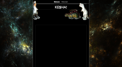
This is our second background we created using photoshop (using the custom shape tool). It took awhile to get the alignments of the dinosaurs correct and to get them facing in towards eachother. The dinosaur background has a fun and colourful vibe to it. It connects well with the song 'dinosaur' and yet because of the black background it still feels like the right genre kesha gives.
Our original idea however was to use some sort of glitter as the background, as kesha is known for the glamourous shine. But because we wanted to include something different and relate more to the song we left it plain and simple (although we may include some use of glitter later on).
INTIAL DESIGN IDEAS
This sheet indicates our first initial design for our website. We focused firstly on the layout and stuck with the main idea of text being viewed in the middle of the screen. We also stayed with the idea of using black as a main colour scheme, this is because of the pop/rock genre we want to portray. This sheet has other ideas such as imagery thoughts and title font display.
Friday, 5 November 2010
Case Study: Mark Ronson
Website Analysis
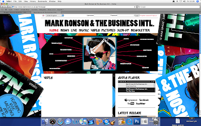
The bright colours of the website and the retro feel links to the style of him as a very poppy/electro artist. It reminds us of his songs and to his album 'Mark Ronson and The Business International'. The fact that the background is of album covers relates back to him promoting his latest album.
The main functions of the website is to research and understand him more as an artist. The website allows us to view his videos and click on links to see latest news articles on where he is, what he's doing and when his tour dates are up and running. There is also a gallery to view images of him at gigs etc, this is nice for fans to see him in action.
This is an example of a comment on his 'latest news' section from a fan :
about 1 week ago Thawiz870 wrote:
Congrats Mark ! Fabulous work ! Your new album is amazing, you've put together something special, enjoy the praise !
Allowing fans to comment on each page shows a connection between the artist and his fans through which they can encourage him and give their own opinions. There is also a link which enables fans to sign up which shows an interactive side to the website.
Postmodernism an Nostalgia
There are 14 inter-textual links which are songs that surround the album cover image, almost like a spider diagram, and when you hover your mouse over the song title or image it zooms in and you can navigate around to the other links.
This is one of the 80's cd covers used in Mark Ronsons album cover, as you can see part of the hair near the front. This is almost like pop art image which is very popular and can relate to the 80's style.
This is one of the 80's cd covers used in Mark Ronsons album cover, as you can see part of the hair near the front. This is almost like pop art image which is very popular and can relate to the 80's style.
Case study:Mark Ronson
Mark Ronson Establishing Styles.
This album cover is made up from many different 80's cd covers combined together to create one image, therefore the music he creates is very much so influenced by the 80's style of music. The colours are vibrant and bright, which gives a retro feel, which young teens may be attracted to. The visual style of this very clever, using different album covers and abstract is a very stereotypical 80's thing. This relates back to what songs are on the CD itself. This is more 80's era, through the album covers that are being used.
The reason this album cover is a mixture of different ripped pieces of paper, is because Mark Ronson does a lot of cover versions of songs therefore the images relate to the idea of covering and layering over things, so this gained Inspirations mainly that came from the artists he's worked with, such as, Amy Winehouse.
It is also very abstract which could relate to the style of music he gives, which is indie/electro. This means vibrant colours are necessary to his style. This is more old by the visual style of the worn down paper.
Tuesday, 2 November 2010
More locations
THE WOODS LOCATIONS (TWO CHOICES)
1.
1.

2.
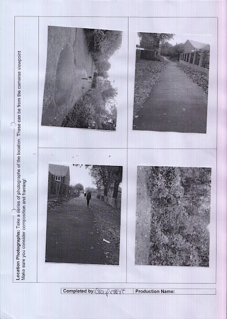
As we have found two locations we did two recee sheets to determine which will be best to use. We looked as a group at them both and decided that the second choice would be easier to access as its nearer to the house location, also we prefer the wood setting because it looks more mysterious and surreal compared to recee sheet number one.
THE WHITE ROOM
The white room we thought was the perfect location for dance and lyric scenes as it is bright and simple which we hope will show off the main character more clearly. We also wanted a bright room for the dream effect so it looks almost unreal. Whilst doing the recee sheet for this location we found there were plugs which could come in handy when using powerful bright lights. There is plenty of room for the dancing which was the main concern of ours when choosing a location.
Location (with reece sheets) + Shot types & Storyboards
When deciding for the main location of film, we decided to look at 2 totally different locations. They both had there advantages as well as there dis-advantages.
First Location: West Bridgeford.
West bridgeford was the first location we looked at. This location was our first choice since it looked alot more like a old persons home without the need of loads and loads of props. This was an advantage to us since it meant that we didn't have to carry loads of props every time we need to shoot or re-shoot something. The other advantage was that it was close to one of our other locations.
Even though this seemed a good location, the actual location of the location seemed to pop up. Even though this was easily accessed by a NCT bus, not all of us in the group have NCT bus passes, therefore this issue was raised and was talked about in great detail.
Below are photo's of the living room (the main room in the narrative).
Secound Location: Aspley
Aspley was the second location which we looked at. This location was always going to be our back-up location, just in case something went wrong with our first option. This location didn't look like an old person's home, so we would need a few props to make the location seem realistic. However, since this is Jordan's house, the props could stay there. One advantage of this was that it was a simple 10 minutes away from college if we ever needed to do a quick re-shoot. It is also accessible by a numerous of NCT buses and also a Trent Barton bus, this meant that all the cast and crew could easily get there.
A dis-advantage of this is that it's always full with family members, therefore would need planning if we wanted too shoot or re-shoot. It was also quite far away from our main option for the forest.
Below are pictures.
Conclusion
After some talking, we came to the conclusion that the first option would be alot better for us. This is because it makes the filming seem more realistic. It was also closer to the better location for the woods, this therefore making it easier to do one long shoot rather than numerous shoots on different days.
First Location: West Bridgeford.
West bridgeford was the first location we looked at. This location was our first choice since it looked alot more like a old persons home without the need of loads and loads of props. This was an advantage to us since it meant that we didn't have to carry loads of props every time we need to shoot or re-shoot something. The other advantage was that it was close to one of our other locations.
Even though this seemed a good location, the actual location of the location seemed to pop up. Even though this was easily accessed by a NCT bus, not all of us in the group have NCT bus passes, therefore this issue was raised and was talked about in great detail.
Below are photo's of the living room (the main room in the narrative).
These are the reece sheets for the West Bridgford living room. On these we think about the power supply, space of the location and where we could place the camera as well as many other things. These are helpful for all of the the locations that we test because it helps us make a correct and accurate decision on where to film.
Secound Location: Aspley
Aspley was the second location which we looked at. This location was always going to be our back-up location, just in case something went wrong with our first option. This location didn't look like an old person's home, so we would need a few props to make the location seem realistic. However, since this is Jordan's house, the props could stay there. One advantage of this was that it was a simple 10 minutes away from college if we ever needed to do a quick re-shoot. It is also accessible by a numerous of NCT buses and also a Trent Barton bus, this meant that all the cast and crew could easily get there.
A dis-advantage of this is that it's always full with family members, therefore would need planning if we wanted too shoot or re-shoot. It was also quite far away from our main option for the forest.
Below are pictures.
Again, like the West Bridgford location, we did another reece sheet for the Aspley location. This was for the same reasons.
After some talking, we came to the conclusion that the first option would be alot better for us. This is because it makes the filming seem more realistic. It was also closer to the better location for the woods, this therefore making it easier to do one long shoot rather than numerous shoots on different days.
LOCATION
West Bridgeford - Kitchen.
Before we even started looking at the scene for the kitchen, we decided to look for the living room scene. This is because they wouldn't be any continaity errors if the main girl went into the kitchen and she came in through a different door or direction. Since we decided on the West Bridgeford location for the living room, we decided on the West bridgeford's kitchen.
This is also alot easier for us since we would be able to do one day location shoots rather than numerous shoots.
The kitchen also reminds us of an old person, witht he old style cooker, the old style tops and cupboards, this again helps us make it seem more realastic.
Below are pictures of the location.
These are the reece sheets for the kitchen. Because we wanted to use this kitchen from the start, we only did a reece sheet for this one. This is because the kitchen is a lot more spacious and would of been easier to get all the equipment + characters in.
STORYBOARD/SHOT TYPES ETC.
These are our shot list. These are going to help us when we do finally go and film since we already have our ideas down on paper and don't have to stand around coming up with them. Even though this is only a rough idea of what we would like the video to look like, we still might change bits when we see what looks decent when filming. It will also save us time when editing since we know what scene goes with what bit in the music.
This is our storyboard. We used this to roughly draw down key scenes or shots which would help us when filming. It also gave us an idea of what we would want a certain scene to look like (for example scene 25 when the girl runs away). It also helped us with the shot type cause we could then say whether a shot type was realistically achievable.
Subscribe to:
Comments (Atom)


